
❄️ Cool Blues Heart Watercolor Tutorial
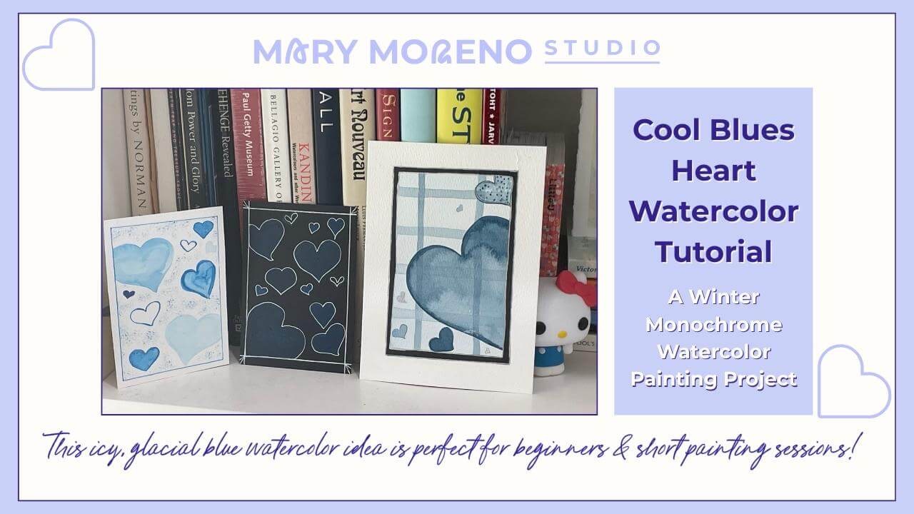
A Winter Monochrome Watercolor Painting Project
✅ Quick Overview
- Why icy, glacial blue palettes feel especially right for winter watercolor projects
-
A cool blues heart watercolor tutorial with room for creative variations
-
How working with one color strengthens water control and value skills
-
A monochrome project that keeps planning and setup minimal
-
Why small, repeatable projects fit real-life painting sessions
Why Winter Is the Perfect Season for Cool Blues
Winter has a way of slowing things down — quieter days, softer light, fewer distractions. It’s a season that naturally lends itself to cool blue watercolor palettes, especially those icy, glacial tones that feel crisp, calm, and refreshing.
If you’ve ever been drawn to frosty blues, pale sky colors, or snow-inspired shades this time of year, you’re not imagining it. Cool blues — think icy blue, glacier blue, and soft monochrome washes — are showing up everywhere across creative spaces, and watercolor is a beautiful medium for exploring them.
Painting with variations of one single color simplifies project planning and preparation, strengthens pigment-to-water mixing skills, and fits especially well into real-life painting sessions. This post is built around that idea: smaller, approachable monochrome projects that make it easier to show up and paint.
In this post, we’ll focus on one simple monochrome winter project: cool blue watercolor hearts. This small, repeatable motif offers plenty of room for exploration through thoughtful practice and joyful creative moments — and easily fits into both short painting sessions or longer ones.
What “Cool Blues” Mean in Watercolor
In watercolor, cool blues tend to feel icy, clean, and light-filled. They often lean slightly toward green rather than purple, which gives them a crisp, winter-appropriate quality.
Some commonly used cool blue pigments include Prussian Blue, Phthalo Blue (Green Shade), Cerulean Blue, and Winsor Blue. If your blue feels clear, fresh, or slightly green-leaning, it will work beautifully for this project.
If the blue you have on hand looks a little softer, warmer, or more purple-leaning, that’s okay too. The focus here isn’t using a “perfect” color — it’s exploring how a single blue behaves when you vary water, color value (light to dark), and repetition.
Painting with a monochrome blue palette removes a lot of unnecessary decisions. With color choice simplified, you can focus more fully on water control, value shifts, and brush movement — all foundational skills that improve with repetition.
This kind of focused approach is especially helpful when you’re working in quick bursts or returning to painting after a break.
Winter Project: Cool Blue Valentine Hearts
This simple heart project is an easy way to explore cool blue watercolor palettes in winter. It reimagines a familiar theme and highlights how color alone can change the mood of a subject.
By working with one familiar shape and a single color, you can focus on water control, value shifts, and repetition — without needing a complex plan or a long stretch of time.
Hearts are especially well suited to monochrome practice. Their shape is forgiving, easy to repeat, and flexible enough to support both loose and more controlled approaches. Painted in icy, glacial blues, they take on a calm, winter-appropriate feel that’s quite different from traditional red or pink versions.
Why it works
-
Hearts are simple and recognizable
-
Cool blues create a clean, modern feel
-
Repeating a single shape builds confidence quickly
What you’ll need
Keep supplies minimal:
-
watercolor paper (any size — small pieces work beautifully here)
-
one cool blue watercolor (or any blue you have in your palette)
-
a round brush you’re comfortable with
-
water and paper towel
That’s it!
Fewer materials help keep the focus on painting rather than setup.
How to approach the project
Begin by lightly planning where your hearts will sit on the page. You might paint:
-
a small cluster slightly off-center
-
a loose scatter across the page
-
or rows or columns
There’s no need to draw them in unless that feels helpful. You can paint the heart shapes directly with your brush, keeping them soft and slightly imperfect (or very symmetrical).
Start with a very diluted blue wash for your first few hearts. Let the paint spread naturally, allowing edges to stay loose. As you continue, gradually increase the pigment concentration for some hearts so you have a range of light, medium, and slightly darker blues.
Pause between layers if you want clearer edges, or work wet-into-wet if you prefer softer transitions. There’s no single “right” way — both approaches build useful skill.
Because you’re working with one color and one shape, the process stays relaxed and intuitive.
Why Monochrome Projects Build Skill and Confidence
Working with a monochrome palette might seem simple, but it’s one of the most effective ways to build watercolor skill — especially as a beginner.
Because you’re using one single color, your attention naturally shifts away from color choice and toward how water and pigment behave on the paper. You begin to notice how much water is on your brush, how value changes affect mood, and how repetition builds steadiness and confidence.
This heart project, in particular, helps you practice:
-
mixing lighter and darker values using the same pigment
-
noticing how value changes affect mood
- controlling water to create soft or more defined edges
-
staying present with repeated brush movements
-
letting small variations happen without correcting every mark
Monochrome projects also support real-life painting rhythms. With minimal setup and a familiar shape, it becomes easier to paint in short sessions — even ten or fifteen minutes at a time — without needing to “get back into it” each time.
Over time, this kind of focused practice builds familiarity and trust with your materials. And that confidence carries forward into future projects, no matter the subject or palette.
Ways to Revisit and Explore This Project
One of the strengths of a simple project like this is how easy it is to return to. You don’t need to invent something new each time — small shifts are enough to create a different experience.
You might choose to:
-
Pigment variation: repeat the project using a different cool blue
- Shape variation: try painting symmetrical hearts, or loose/lopsided/one-of-a-kind hearts
- Value variation: keep some hearts very pale and let others deepen
- Edge variation: paint a few with crisp edges and others with soft, blurred ones
- Spacing variation: try hearts closer together, or purposely spaced apart
- Placement variation: try a scatter pattern, or work on the diagonal
- Scale variation: mix small hearts with one or two slightly larger ones
This project also works well as:
-
a sketchbook study
-
a short warm-up before a longer painting session
-
a simple handmade card or tag
-
a calm way to paint when focus or energy is limited
Revisiting the same idea — especially with one color — builds familiarity and ease. Each repetition strengthens skill without adding pressure, and each variation teaches something slightly different.
BONUS: Two Winter Monochrome Exercises
For those days where you are extra-short on time or not in the mood for a project, here are two easy exercises that allow you to play with cool blue pigments and be creative.
First, pick your color!
- If you want, take a moment to notice how blue shows up in winter where you live — the sky, distant hills, shadows, or early evening light. Choose the blue that feels closest to that experience.
- Or, reach for a favorite blue.
Then, decide if you feel more like painting:
- A free-flowing Monochrome Gradient Wash, moving slowly down the page from dark to light using relaxed, methodical strokes — just color and water.
- Or, a slightly more-structured Monochrome Striped Pattern, using lighter and darker values of your chosen blue — the stripes can be thick or thin, or both — sharp-edged or a little irregular
These simple exercises:
-
strengthen pigment-to-water mixing skills
-
build confidence with smooth transitions
-
require almost no planning or setup
-
fit easily into busy schedules
It’s painting. It's creative engagement. It counts.
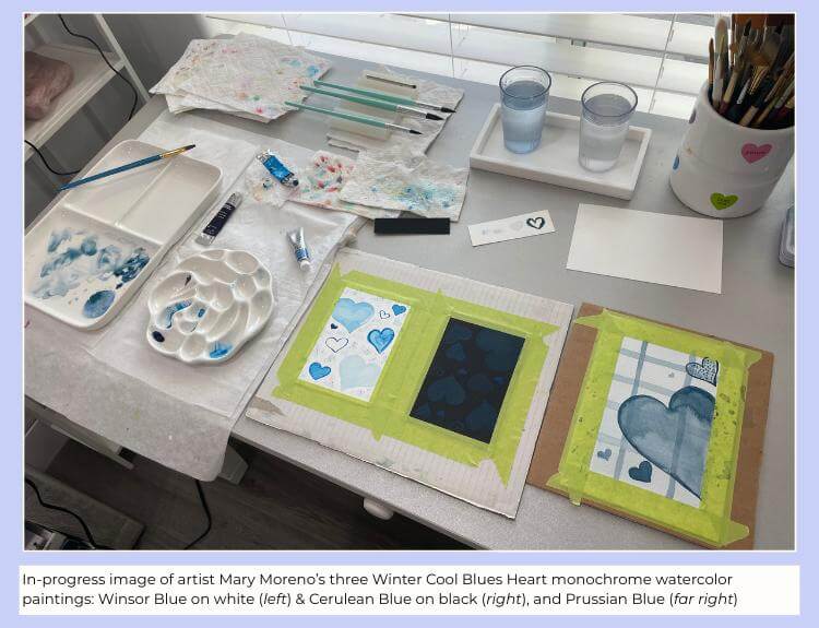
Photo showing artist Mary Moreno's taped-down Cool Blues Heart watercolor paintings in progress, together with blue watercolor tubes and mixing palettes.
Artist’s Note
I wanted to share how I personally explored this Cool Blues Heart project during my painting session.
I worked with two cool blue palettes side by side. For one version, I chose Cerulean Blue Hue on black watercolor paper, knowing that more opaque pigments have the best chance of showing up on a dark surface. For the other, I used Winsor Blue (Green Shade) on white watercolor paper, which allowed me to explore a wider range of values and some soft blooms.
Painting the two smaller pieces at the same time highlighted how much paper color and pigment choice affect the final result. The Cerulean Blue, even at its darkest, remained subtle on black paper, while the Winsor Blue on white paper offered more contrast and variation. Both approaches were interesting in different ways.
Partway through the session, I felt inspired to try a third version. I began with a pale Prussian Blue background wash, let it dry completely, then layered a few simple stripes before adding a large heart and several smaller ones. This version introduced layering while still staying within the same monochrome idea.
Although all three paintings use a scattered heart pattern, each looks quite different due to changes in size, placement, edges, and pigment behavior. I also added minimal pen details and borders to help certain elements stand out — another reminder that small finishing choices can shift the overall feel of a piece.
Even when a particular experiment didn’t behave exactly as expected, I found value in trying it. This session reinforced how repeatable and flexible this project is — and how much can be learned simply by exploring the same idea in a few different ways.
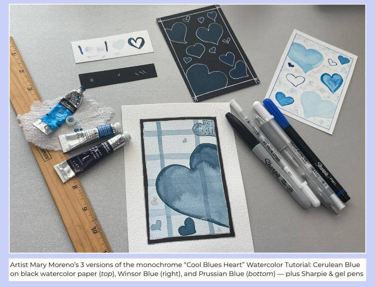
Photo showing artist Mary Moreno's completed 3 versions of the monochrome Cool Blues Heart Watercolor Tutorial, alongside ruler, paint tubes, and assorted pens.
What’s Next in the Seasonal Painting Series
This winter post sets the tone, but it’s just the beginning. Future seasonal projects will explore how monochrome palettes and color temperature shift throughout the year — fresh cool yellows in spring, warm blues in summer, and warm golden-yellow tones in fall. Keep a look-out, and jump in wherever the timing feels right.
💬 Closing Thoughts for Today
Color trends may shift over time, but learning to work comfortably within a single color palette is a skill that carries forward into every season. This winter cool blue project isn’t about mastering technique or producing a finished piece — it’s about making space to paint in a way that fits the season you’re in.
Whether you explore a few heart variations, repeat the same shape across a page, or choose the simpler gradient wash instead, you've shown up and engaged with color thoughtfully.
Seasonal creative planning sets the focus. Small projects like this one help bring that focus to life. If you paint or sketch or plan just one small piece from this post, that is winter creative engagement. Allow winter to carry you forward, and let your creative practice move alongside — and in harmony with — the season.
🔗 Recommended for You
Author

