
How to Mix Watercolors Without Making Mud — Beginner Tips for Clean, Vibrant Colors
✅ Quick Overview
-
🎨 Learn what causes muddy watercolor mixes and how to avoid them
-
✔️ Discover the 3 beginner-friendly rules for clean, vibrant color mixing
-
🔄 Understand how pigment type, transparency, and overmixing affect results
-
🧪 See examples of safe color combos — and how to mix neutrals without mud
-
💡 Includes tips for using the color wheel, reading paint labels, and building confidence
Introduction
If you’ve ever ended up with a muddy brown mess when you were aiming for something bright and beautiful — you’re not alone. It’s one of the most common (and frustrating!) experiences for watercolor beginners.
But here’s the good news: you can mix clean, vibrant colors — even if you’re just starting out.
And in today’s post, I’ll walk you through how.
This beginner-friendly guide will help you:
-
Understand why "mud" happens in watercolor
-
Learn how to avoid it with a few simple rules
-
Practice smart, clean color mixing with confidence
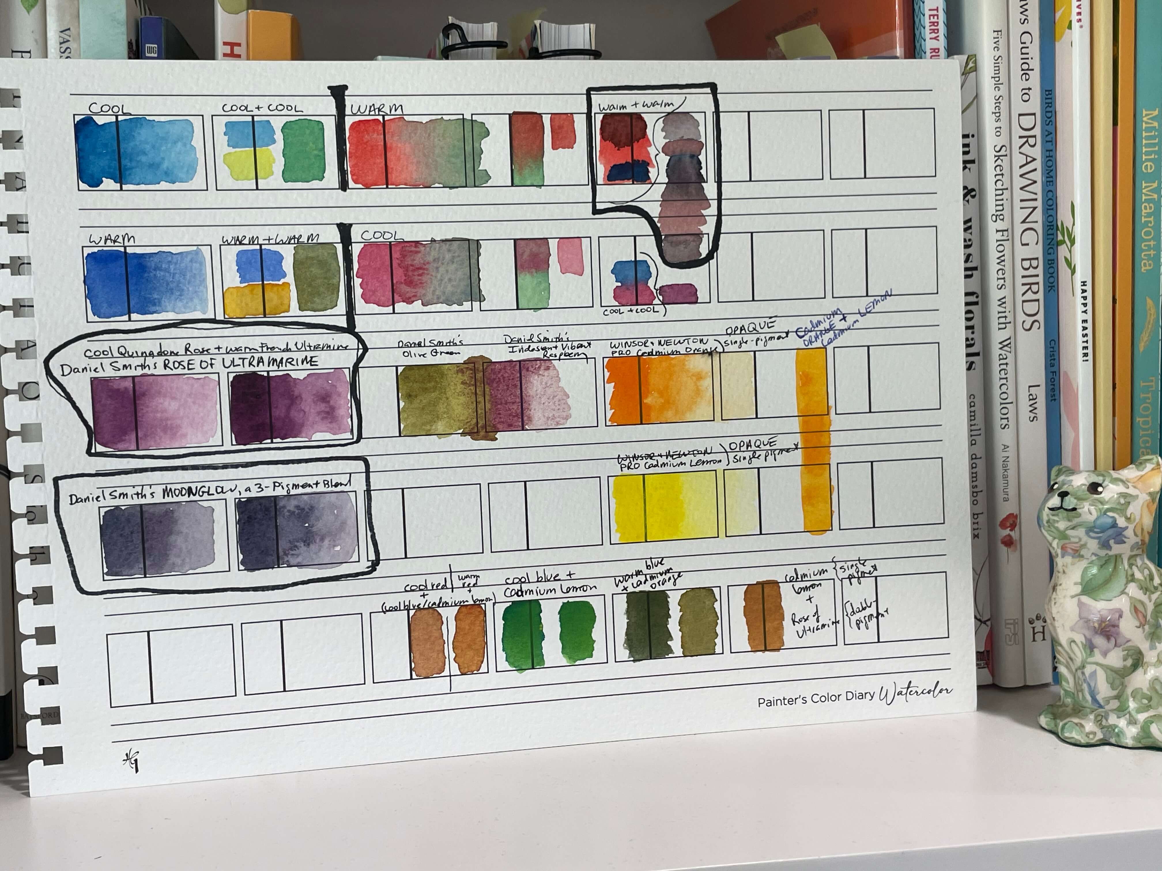
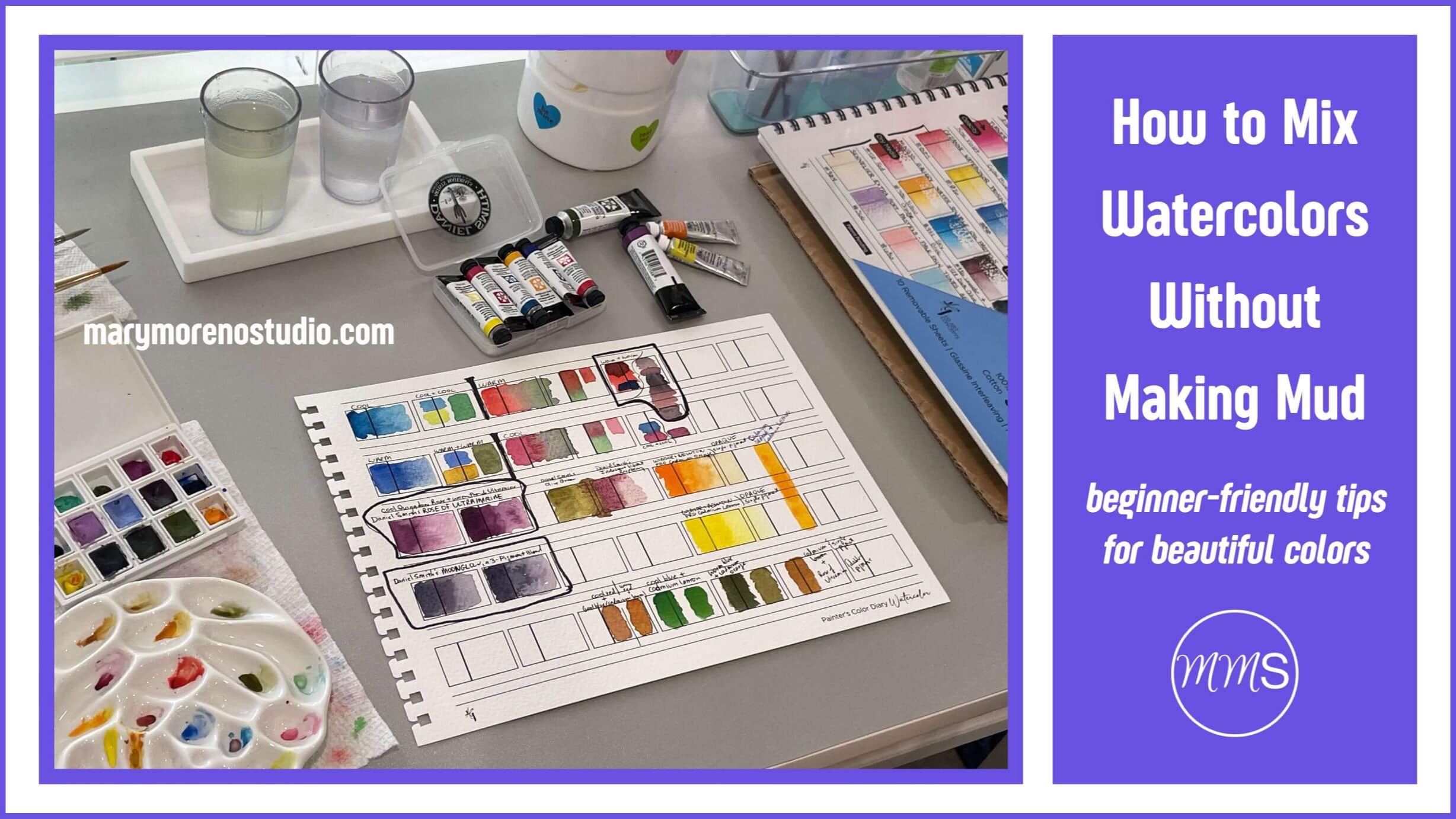
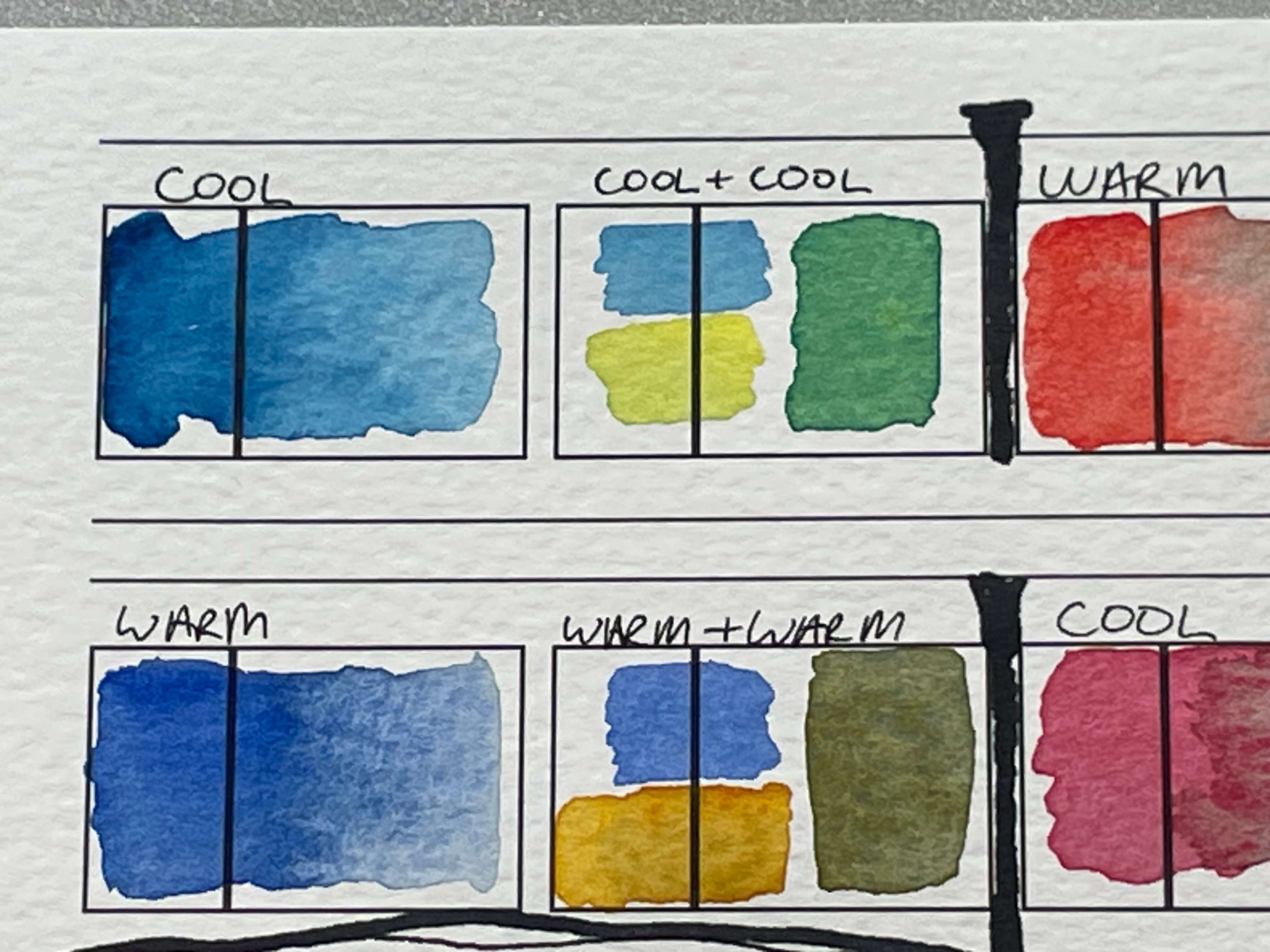
My color-mixing swatches of cool + cool, warm + warm, single pigments & blended pigments, and opaque paints.
🎨 What Does “Muddy” Mean in Watercolor?
When watercolor artists say a color looks muddy, they usually mean it looks dull, flat, or brownish — not the clean, vibrant color they intended.
Mud often shows up when:
-
Too many pigments are mixed together
-
Complementary colors are combined unintentionally
-
Opaque or heavily granulating pigments are overused
-
Wet areas are reworked too soon, turning vibrant layers into mush
👉 Don’t worry if “complementary” or “granulating” are new terms — you can find simple definitions in the Beginner’s Watercolor Glossary.
🚫 3 Key Tips to Prevent Muddy Mixes
✅ 1. Limit the Number of Colors
Stick to 2 colors, 3 max.
The more pigments you mix together, the more likely you’ll get a dull or gray result. Try starting with just two transparent colors — and add water, not more paint, if you want variety.
💡 Tip from my Easy Color Mixing & Pigment Guide: “Transparent pigments create clean, luminous glazes… Opaque pigments can look chalky or muddy when overused.”
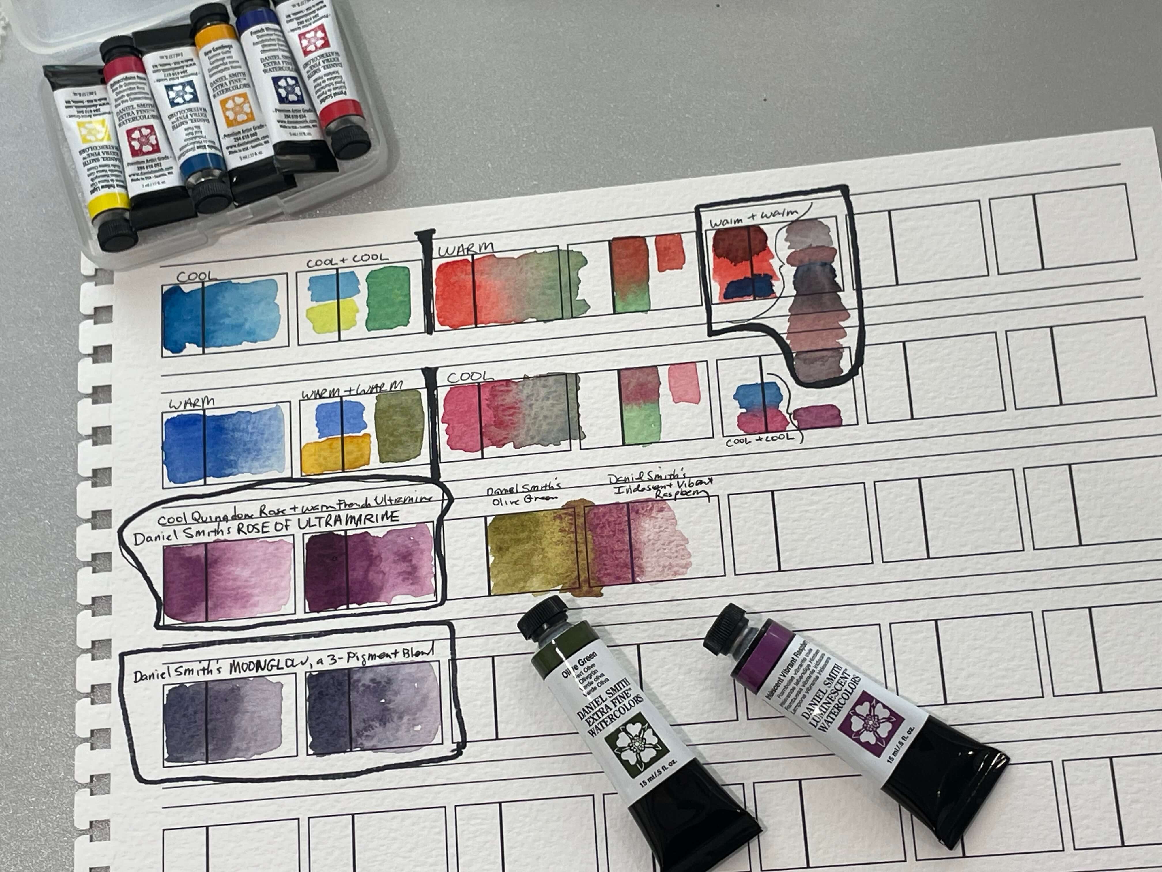
Color-swatching cool + cool, warm + warm, and single & blended pigments — these are all Daniel Smith watercolors.
✅ 2. Understand Complementary Colors
On the color wheel, complementary colors are opposites — like red and green, or blue and orange. When combined carefully, they create rich neutrals or shadow tones.
But if you mix too much of each one? They’ll cancel each other out into brown.
👉 Try this: Mix a small amount of red into green — you’ll notice it gets muted fast. Use this intentionally for shadows, but avoid it if you’re after bright greens or reds.
👉 For a color wheel refresher (and more), scan my Easy Color Mixing & Pigment Guide.
✅ 3. Use Transparent or Single-Pigment Paints When Possible
Some watercolor paints are made from just one pigment — while others are blends of two or more pigments. You’ll often see this listed on the label as a pigment code, like:
-
PR 106 = Pigment Red
-
PY 150 = Pigment Yellow
-
PB 29 = Pigment Blue
Paints with a single pigment are generally more reliable for mixing clean, vibrant color. The more pigments in a mix (especially opaque ones), the more likely your color will turn muddy.
💡 Tip: You can usually find pigment codes and transparency info on the paint tube, pan packaging, or brand website.Transparent, single-pigment paints give you the most control as a beginner.
🔍 Using a pan set? You might not see pigment codes printed on the pans themselves — but many brands include a pigment chart in the box or make one available online. Check the packaging insert or visit the manufacturer’s website to look up pigment codes for your specific set.
📚 Want to dive deeper into pigment codes and what they mean?
Here are two helpful guides:
– How to Read Watercolor Labels — EtchrLab
– What Are Pigment Numbers? – Jackson’s Art Blog
Swatching cool blue + cool yellow, and warm blue + warm yellow, yielded two very different greens!
🎨 Beginner-Friendly Color Mixing Combos
Here are a few reliable starting points that mix well and stay bright:
-
Warm yellow + cool blue → clear, fresh green
-
Cool red + cool blue → vibrant purple
-
Warm red + warm yellow → cheerful orange
👉 Use a small swatch chart or test scrap to try these before painting directly on your artwork.
And remember: the temperature of your color (warm vs. cool) makes a big difference.
Cool + Cool tends to stay clean.
Warm + Warm can go earthy.
Warm + Cool often lands somewhere in the middle — soft, muted tones.
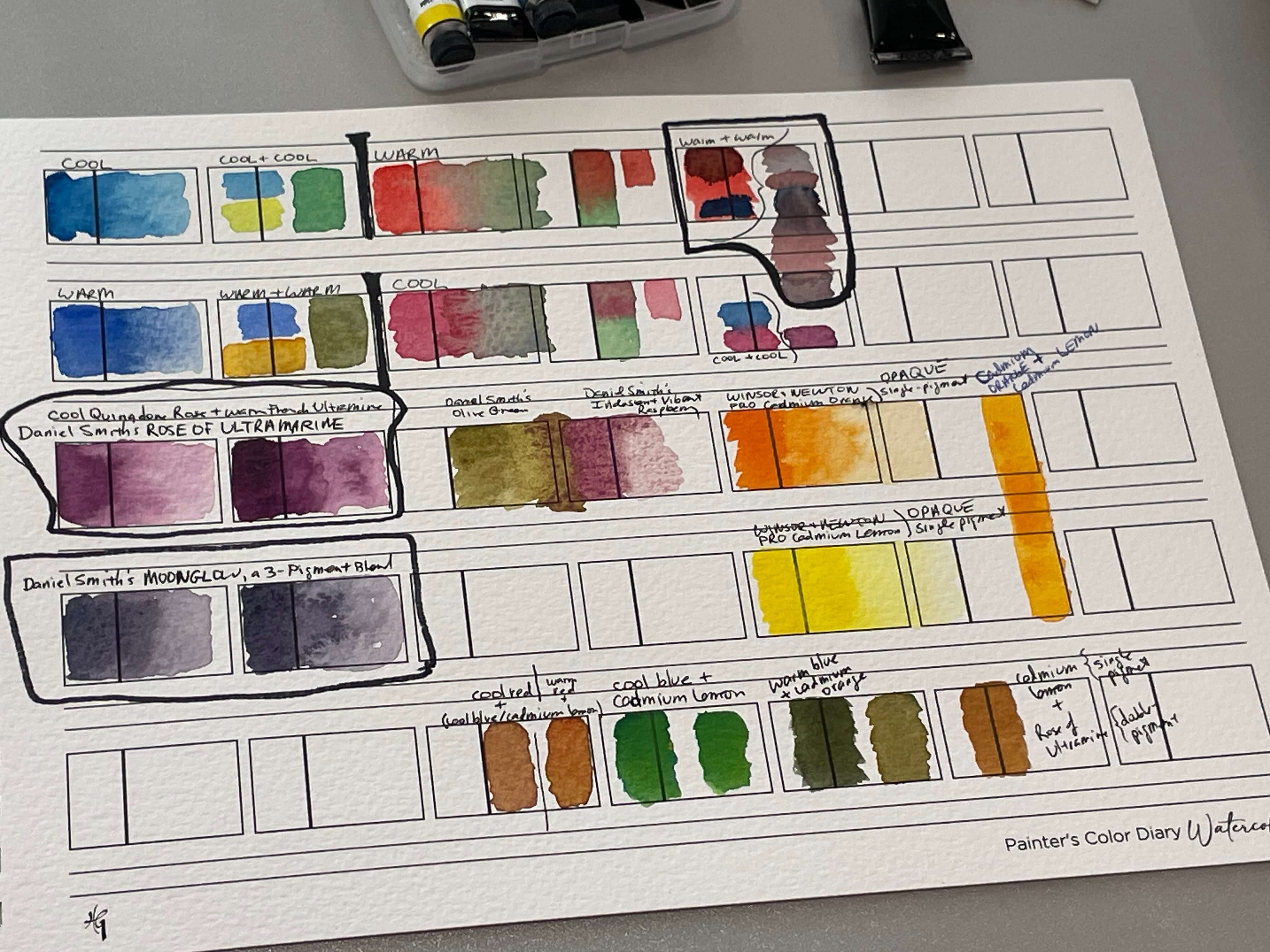
Can you see the lovely neutrals resulting from mixing Warm Red + Warm Blue (upper right)?
🎨 How to Mix Neutrals Like Grays or Browns (Without Mud)
Want to tone things down or create natural-looking shadows without reaching for black? You can mix your own beautiful neutrals — like soft grays and earthy browns — using just two complementary colors.
But here’s the key to avoiding mud:
-
✅ Use only two pigments at a time
-
✅ Choose transparent or single-pigment paints when possible
-
✅ ✅ Stop mixing as soon as you see a rich, muted tone — overmixing is what makes it muddy!
💡 Try This:
Mix Ultramarine Blue and Burnt Sienna — a classic combo for soft, natural grays. You’ll see the granulation and transparency create depth, not dullness.
👉 This kind of mix is especially useful for shadows, skies, or stone textures — and is much more lifelike than flat black or gray from a tube. If you're laying down a wash for a sky, my step-by-step guide to watercolor washes will walk you through how to create smooth color.
🧪 Curious about color combos? I’ll walk you through more combos + mixing strategies in next week’s post: Quick & Simple Color-Mixing Exercises for Beginners :)
🚫 Common Color Mixing Mistakes to Avoid
Here are a few easy-to-make mistakes that can lead to muddy results:
-
Overmixing on your palette — mix just until the color looks right, not until it’s uniform
-
Painting into a still-wet area with a contrasting color — you may end up with unexpected blends
-
Not rinsing your brush fully between colors — leftover paint can accidentally dull your mix
-
Using dirty rinse water — always keep one jar for rinsing and one for clean water!
💬 Closing Thoughts for Today
If you’ve made a muddy mess — welcome to the club!
Every watercolor artist has been there.
Color mixing is a playful, skill-building process — and yes, sometimes you’ll make mud. That doesn’t mean you’ve failed. It means you’re experimenting, exploring, and learning how your paints behave. Keep going!
🎨 Your brush knows more than it did yesterday (and so do you!) — and that’s exactly what progress looks like.
➡️ What’s Next?
Want to practice everything you learned today — in a low-pressure way?
👉 My Quick & Simple Color-Mixing Tutorials for Beginners round-up post walks you through easy, effective mixing exercises perfect for color exploration and for warm-ups!
📚 References
-
Artist's Manual, edited by Angela Gair
- Color, A Practical Guide to Color and Its Uses in Art, by Walter Foster Creative Team
- The Beginner's Guide to Watercolor Labels, EtchrLabs, 2022
- What Is the Pigment Color Index? Jackson's Art Blog, 2025
🔗 Recommended for You
Author

