🎨 Watercolor Basics for Beginners #4 — Easy Color Mixing & Pigment Guide

Tips, Theory & Exercises for Total Beginners
Welcome back to my Watercolor Basics for Beginners series! So far, we’ve covered:
-
Choosing the right watercolor paper
-
Selecting the right brushes
-
Picking your paints
And today, we’re diving into one of the most exciting (and sometimes intimidating!) parts of watercolor:
Mixing Colors 🎨
Mixing colors is where creativity really begins to take shape! But for beginners, it can feel confusing at first. Maybe, like I did, you're wondering: How do I know which colors to combine? How can I get the color I want without it going flat or muddy?
When I started watercolors in 2020, I bought a 36-color paint set because I found the very idea of color mixing daunting. But, very soon I learned that mixing colors is actually pretty simple and fun — and with a little practice I know it will be for you too.
This guide will help you understand color theory in a practical way, explore the color wheel, and gain confidence through simple color mixing exercises.
Before no time, you'll be creating beautiful, singular colors that make your painting truly your own.
Let's jump in!
Why Learn to Mix Watercolors?
Mixing your own colors opens up a whole new level of creativity. Instead of needing dozens of paint tubes, you can create a wide variety of shades and tones from just a basic palette.
Bonus: It saves money and frees up space for more fun supplies. Win-win!
Beyond practicality, color mixing lets you:
-
Express mood
-
Create depth
-
Add your unique voice to each piece
Plus, it’s just fun — it feels a little like magic every time :)
🎨 Basic Color Theory (Made Simple)
Let’s start with the essentials:
Primary Colors
-
Red, Yellow, Blue
-
These cannot be made by mixing other colors.
Secondary Colors
-
Orange, Green, Purple
-
Made by combining two primaries:
-
Red + Yellow = Orange
-
Yellow + Blue = Green
-
Red + Blue = Purple
-
Tertiary Colors
-
Made by mixing a primary with a neighboring secondary, like:
-
Yellow-orange
-
Blue-green
-
👉 Tip: Visualizing a simple color wheel can help — it shows how colors relate to each other and what combinations tend to work best.
Here’s a wheel I painted recently. I accidentally sketched 16 spokes (instead of 12 😅), but I rolled with it anyway — and came up with a unique color wheel that beautifully illustrates how these colors relate to each other.
Colors used:
-
Cool primaries: Hansa Light Yellow, Quinacridone Rose, Phthalo Blue (Green Shade)
-
Warm primaries (3-spoke comparison): New Gamboge, Pyrrol Scarlet, French Ultramarine

Image of the color wheel I painted with Daniel Smith primary colors
🖌️ Try this: Make your own mini color wheel with your paints — it doesn't have to be perfect!
Video tutorial recommendation: artist Emma Jane Lefebvre's How to Make a Color Wheel
🎯 Understanding Color Harmonies
Color harmony = colors that work well together! Here are beginner-friendly combos:
Monochromatic
Shades of the same color
👉 Peaceful and cohesive

Monochromatic example: Blue #3 by Georgia O'Keeffe
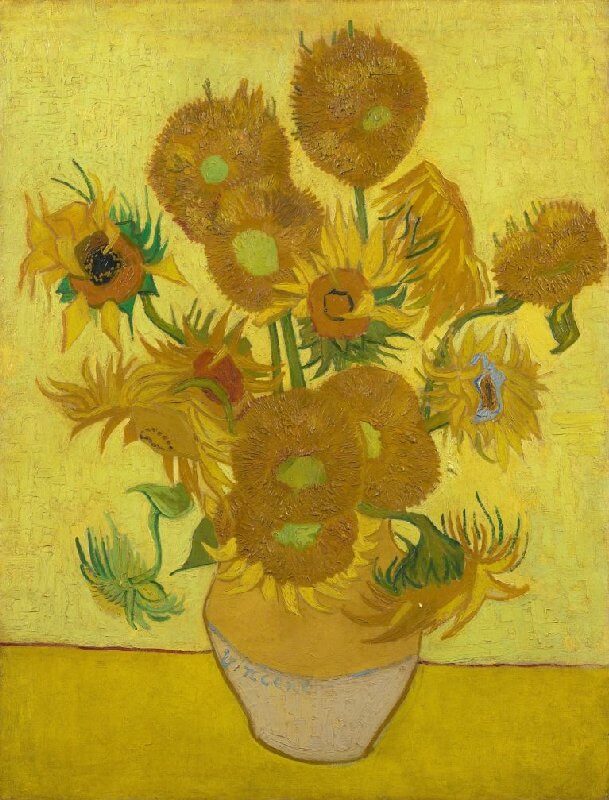
Analogous
Colors next to each other on the wheel (e.g., yellow, yellow-green, green)
👉 Natural and soothing

Analogous example: Sunflowers by Vincent Van Gogh
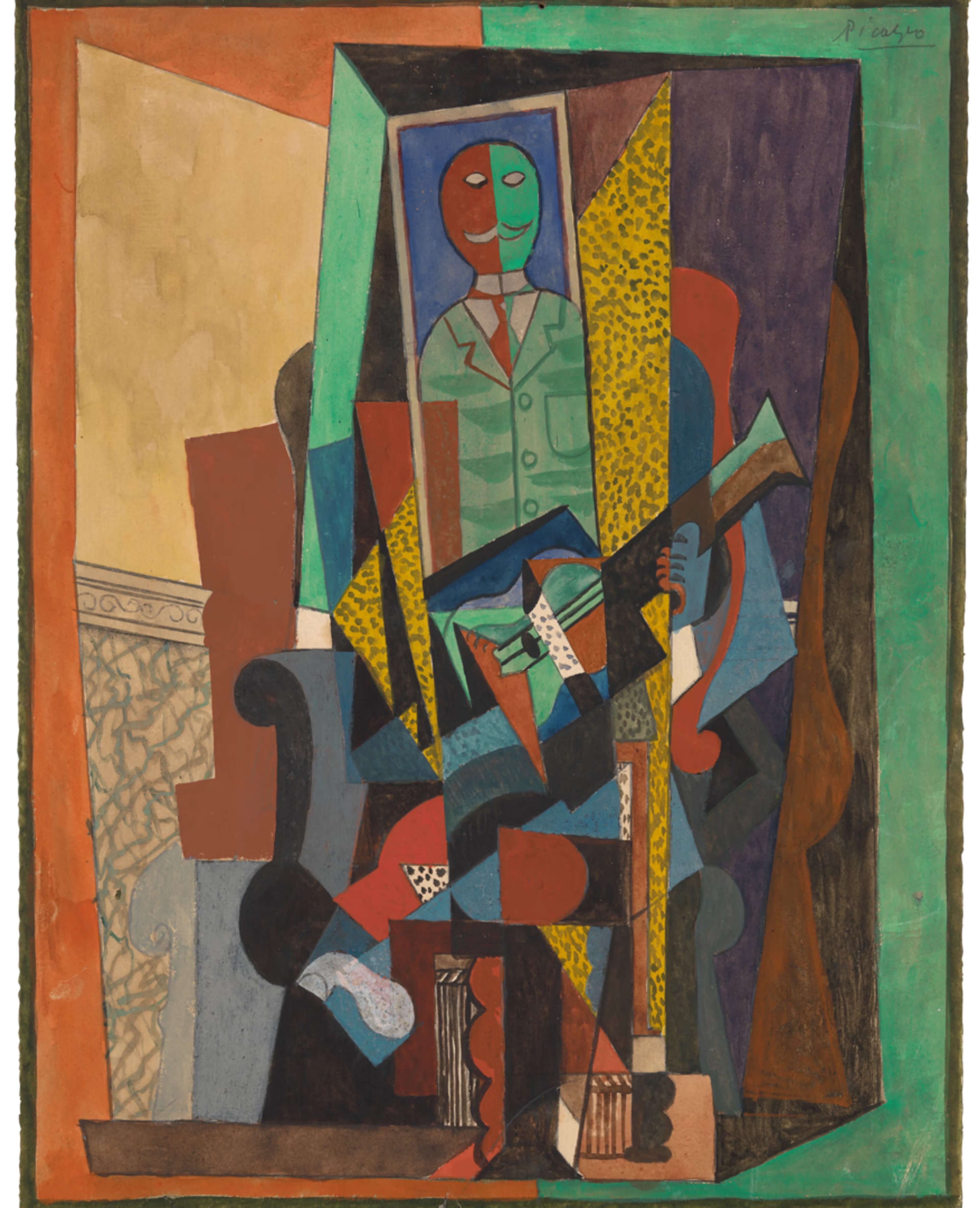
Complementary
Colors opposite on the wheel (e.g., blue & orange)
👉 Bold contrast — mix carefully to avoid mud
Complementary example: Man With A Guitar by Pablo Picasso
Split-Complementary
A base color + the two beside its complement (e.g., blue + red-orange & yellow-orange)
👉 Safer contrast with more harmony
Triadic
Three evenly spaced colors (e.g., red, yellow, blue)
👉 Vibrant and energetic — pick one to lead
Knowing a little about color harmonies makes mixing easier and more intentional. You don't have to memorize them — just keep the ideas in mind as you explore!
🎨 Practical Ways to Mix Watercolors
1. Mixing on the Palette
-
Use a mixing tray, palette lid, or ceramic plate.
-
Start small — swirl two colors together gently.
-
Begin with the lighter color, then add the darker slowly.
-
Add water to soften the mix if needed.
2. Mixing on the Paper (Wet-on-Wet)
-
Wet the paper first.
-
Drop one color in, then another nearby.
-
Let them swirl and mingle naturally.
👉 Great for skies, florals, and dreamy effects!
🧪 Beginner Tip: Test Before You Mix
Always test your mixes on a scrap of watercolor paper:
-
Check for smoothness or separation
-
See how the colors behave when wet and dry
-
Look out for unexpected textures (especially with granulating pigments!)
👉 Testing first helps build confidence and can spark new creative ideas!
💧 Water Control: Your Secret Superpower
How much water you use = a big factor in your final color:
-
More water = lighter, more transparent
-
Less water = bolder, more intense
🎯 Experiment with different water-to-paint ratios to get a feel for how your paints behave.
🧬 Understanding Pigment Characteristics
This is where color mixing becomes even more powerful — and a little bit magical! Knowing the unique traits of your pigments will help you predict how your colors behave and mix.
🎨 Color Temperature (Cool vs. Warm)
Color temperature impacts hue and vibrancy so it plays a huge role in how your mixes turn out.
-
Cool colors (like Phthalo Blue or Quinacridone Rose) tend to create clean, bright mixes.
-
Warm colors (like New Gamboge or Pyrrol Scarlet) lean toward rich, earthy results.
-
Mixing cool + cool gives vibrant results; warm + warm leads to muted tones.
-
A cool + warm mix often results in a neutral or duller shade — great for shadows or subtle backgrounds.
👉 Tip: Try mixing two “reds” — a cool one and a warm one — with blue and watch how different the purples turn out!
🌫️ Transparency vs. Opacity
This affects the clarity and luminance of the mix. Some watercolor pigments are transparent, while others are opaque — and that affects how your layers build.
-
Transparent pigments create clean, luminous glazes. They're ideal for layering and soft blends.
-
Opaque pigments can look chalky or muddy when overused, especially in mixes.
👉 Use opaque + opaque mixes sparingly or intentionally when you want a flat or matte look.
🧲 Staining vs. Granulating
These two traits can really affect the texture and handling of your paint:
-
Staining pigments (like Phthalo Blue) soak into the paper and are hard to lift or scrub off.
-
Granulating pigments (like Ultramarine or Cobalt) separate and settle into the texture of your paper, creating beautiful, organic effects.
You can also get magical results by mixing a granulating pigment with a smooth one — the textures can dance together in fascinating ways.
🧪 Traditional vs. Modern Pigments
There’s a noticeable difference between traditional mineral-based pigments and their modern synthetic counterparts:
Traditional Pigments
-
Often made from minerals or natural earth (e.g., Burnt Sienna, Cobalt Blue)
-
Granulate more due to coarser pigment particles
-
Can be more challenging to blend because of the larger and more varied particle sizes
-
Add texture and character — ideal for landscapes and organic forms
Modern Pigments
-
Usually synthetic (e.g., Phthalo, Quinacridone, Perylene)
-
Smooth, bold, vibrant even in dilute washes
-
Mix more predictably because of their consistent particle size and behavior
-
Great for bright illustrations, florals, or when you want crisp, clean color
👉 Explore both! Many artists love combining traditional paints with punchy modern hues.
🚫 Common Beginner Mistakes (And How to Avoid Them)
Here are a few pitfalls I’ve faced (and seen others make):
-
Over-mixing: Leads to flat, muddy colors — for lively, colorful colors, stop mixing while you can still see a slight color variation and texture
Dirty water: Keep two jars — one for rinsing, one for clean water
-
Contaminated brushes: Rinse thoroughly between colors
-
Not testing mixes: Swatch before committing to your painting!
💡 Essential Color Mixing Tips
Here’s a roundup of practical, beginner-friendly mixing advice:
-
Start with the lighter color and slowly add the darker
-
Keep water clean and rinse brushes thoroughly
-
Wet paint dries darker — plan accordingly
-
Lighten with water (not white paint)
-
Darken with complements, not just black
-
Use scrap paper to test your mixes before applying
-
Build a swatch journal to label your favorite combos so you can recreate them later
-
Be playful! Mixing is part science, part surprise — let yourself experiment
🧪 Easy Beginner Color Mixing Exercises
🎯 Try these fun, low-pressure exercises:
1. Make a Simple Color Mixing Chart
-
Use three primary colors (red, yellow, blue)
-
Mix them together in different combos
-
Create a little grid and label the colors you make!
2. Blend Colors on Wet Paper (Wet-on-Wet Blending)
-
Paint a wet patch
-
Drop in two colors close together
-
Watch how they mix and move
3. Practice Neutral Mixing
-
Try mixing two complementary colors (like blue and orange) to create interesting neutral tones such as muted grays and browns
💬 Final Thoughts
Color mixing in watercolor is a skill that grows with curiosity and play. You don’t need to memorize everything — just start exploring!
Even if you only have 10–15 minutes to paint, that's perfect for practicing mixes. Over time, your color instincts will sharpen and your confidence will grow.
Thanks for joining me today! If you try any exercises, I’d love to hear about it — leave a comment or tag me on Instagram @MaryMorenoStudio.
📚 References
-
Artist's Manual: A Complete Guide to Painting and Drawing Materials and Techniques, edited by Angela Gair (1995 HarperCollins Publishers).
-
Color, A Practical Guide to Color and Its Uses in Art, by Walter Foster Creative Team (2017 Quarto Publishing).
-
Hello Watercolor! Creative Techniques and Inspiring Projects for the Beginning Artist, by Jeannie Dickson (2020 Get Creative 6).
-
The Joy of Watercolor, 40 Happy Lessons for Painting the World Around You, by Emma Block (2018 Running Press).
🔗 Related Posts
-
Watercolor Basics #1 – How to Choose the Right Watercolor Paper
-
Watercolor Basics #2 – How to Choose the Right Watercolor Brushes
-
Watercolor Basics #3 – How to Choose the Right Watercolor Paints
🔜 Coming Soon…
Next in the Watercolor Basics for Beginners series: Painting Washes — a fundamental skill in watercolor. Don’t miss it!
About the Author
Written by Mary Moreno of Mary Moreno Studio, self-taught watercolor artist since 2020 and creative blogger sharing practical, beginner-friendly tips and tutorials.
Exploring watercolors? Let's stay in touch.
Subscribe to our newsletter for watercolor inspiration, practical tips, and honest reflections on learning to paint from a self-taught artist. No pressure — just encouragement, progress, and paint-spattered joy.


